ShopDreamUp AI ArtDreamUp
Deviation Actions


Suggested Deviants


Suggested Collections


You Might Like…


Featured in Groups


Description
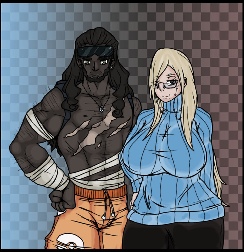
Whitney and Blake are half siblings; your mother is Whitney's real mother while your father is Blake's real father. But your parents have been married so long it doesn't really get mentioned much. It only makes sense that Whitney and your mother look similar, so curvy, long blonde hair, pale skin and glasses are a must. Why are all mothers in Pokemon games skinny? And for your father; dark skin, athletic build and lots of scrapes.
Your mother is a stay at home mom and your father works as a patroller in the Sandstorm Plains defeating Pokemon that get to tough and protecting travelers in danger. You may even run into him one or two times in the game. Dads in Pokemon games are almost never seen so this guy needs to be shown a few times; maybe have a double battle with him against a rogue Pokemon mark?")
Whitney: midnitez-remix.deviantart.com/…
Blake: midnitez-remix.deviantart.com/…
Player's Mother & Father (c) Me
Your mother is a stay at home mom and your father works as a patroller in the Sandstorm Plains defeating Pokemon that get to tough and protecting travelers in danger. You may even run into him one or two times in the game. Dads in Pokemon games are almost never seen so this guy needs to be shown a few times; maybe have a double battle with him against a rogue Pokemon mark?
Whitney: midnitez-remix.deviantart.com/…
Blake: midnitez-remix.deviantart.com/…
Player's Mother & Father (c) Me
Image size
805x832px 538.36 KB
Comments34
Join the community to add your comment. Already a deviant? Log In
First off, I have to say I love the literal use of black and white imagery in this whole gray project. You've really taken the whole yin-yang notion that's been toyed with through the series to a logical and interesting extreme. I mean, even their style of dress is opposite! These two characters really visually symbolize the notion of dissimilar ideas meeting, and that being the key to growth as people and as a society in a way that Blake and Whitney cannot by virtue of their union. The characters also bear a reasonable resemblance to their respective parent, though I must say I can see more of Whitney in mom than Blake in dad.
That said, what struck me enough to comment here was the anatomy. Now, I am no expert at drawing anatomy, but there are a few things I know about it. Some of them are from studying art, and some of them are from seeing my own body in the mirror daily, and seeing the bodies of the people around me daily as well.
Both of these characters are drawn to idealized extremes. I understand that's a stylistic choice and it serves a variety of thematic functions, but one has to ask one's self how far is too far. If the father here is taken too far, it isn't by very much. That kind of depiction is common in media, unrealistic though it is.
But mom's breasts are quite literally so large I find it hard to pay attention to anything else... as a straight, nearly asexual female.
I have never seen breasts that large. The largest breasts I have seen have never been anywhere near that shape. I understand stylized, giant round breasts are an anime trope and you're explicitly setting out to deal with extremes, but you may be blocking out the rest of the image by how much further you took the mother to her sex's impossible extremes than you did the father. It would be less noticeable, I think, if her waist and hip anatomy were more consistent with her chest size. Much smaller hips and large breasts suggesting augmentation, or a larger waist suggesting obesity as a contributing factor to her size would lessen the impact. Making her more clearly obese would also add to the contrast, with him being super fit and her being fairly fat.
Understand that I don't have a complaint about her breast size in absolutes; you can draw what you want to. It's your art. I just think that in this case it's detracting from the deeper meaning you've clearly put in here.
I also want to comment on your use of color. Having his pants more exactly match the red coloration on the far right behind her would create more of a sense of harmony. I would also slightly adjust the coloration of his pants toward either red or yellow for more clear contrast. Right now it's creamsicle orange, and it's just not warm enough to properly set off her sweater the way I expected. I am also surprised at the difference in skin tones. He's black and she's white, but she has a much more pinkish tone and he's much more gray. Adding a slight purplish or red tone to his skin might make him take his proper place in being noticeable in the image. I suggest looking at pictures of actual black people with both cool and warm complexions to get an idea of how you might play with that.
So in short, the idea you have here is very brilliant and appropriate on many deep levels. Most aspects of your design serve this obvious deeper meaning very well. The few that don't are an understandable extrapolation from your theme of extremes that have become extreme to the point of distraction, although I think some of them could be better tweaked by studying female anatomy and African skin coloration than by merely "toning something down."